1. The Invisible Skeleton (Grid Systems)
Every page has a skeleton — you just don’t see it.
Imagine the page stretching like a yoga instructor at 6 AM, quietly aligning itself into neat columns and rows. That’s the grid.
It’s the first secret of the Anatomy of Premium Editorial Design, giving structure, balance, and that “everything just feels right” sensation.
2. The Voice of the Story (Typography)
Fonts aren’t just letters — they’re characters in your story.
A serif font leans in like a wise mentor. A sans‑serif pops up like a friendly guide. A bold headline kicks the door open with confidence.
Typography sets the tone long before the reader processes a single word.
3. The Guided Tour (Hierarchy & Flow)
Hierarchy is the tour guide of your publication.
Big headline? “Look here first.” Medium subheading? “Now follow me.” Small caption? “Psst… here’s a little extra.”
This is where the Anatomy of Premium Editorial Design becomes choreography — your eyes dance across the page without even trying.
4. The Breathing Space (White Space & Rhythm)
White space is the unsung hero.
It’s the pause between thoughts. The deep breath before the next idea. The difference between “premium” and “please stop shouting at me.”
Good editorial design knows when to speak — and when to stay silent.
5. The Emotional Anchors (Imagery & Illustration)
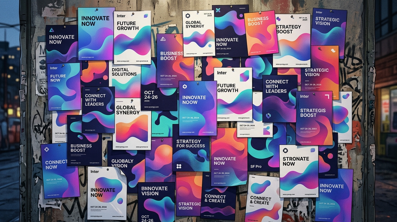
Images aren’t decorations. They’re emotional shortcuts.
A single photo can set the mood faster than a paragraph ever could. A subtle illustration can guide the reader without stealing the spotlight.
In the Anatomy of Premium Editorial Design, imagery is the seasoning that turns a simple dish into a signature one.
6. The Final Polish (Consistency & Accessibility)
This is the part nobody notices — unless it’s missing.
Consistent spacing. Predictable patterns. Readable contrast. Accessible text sizes.
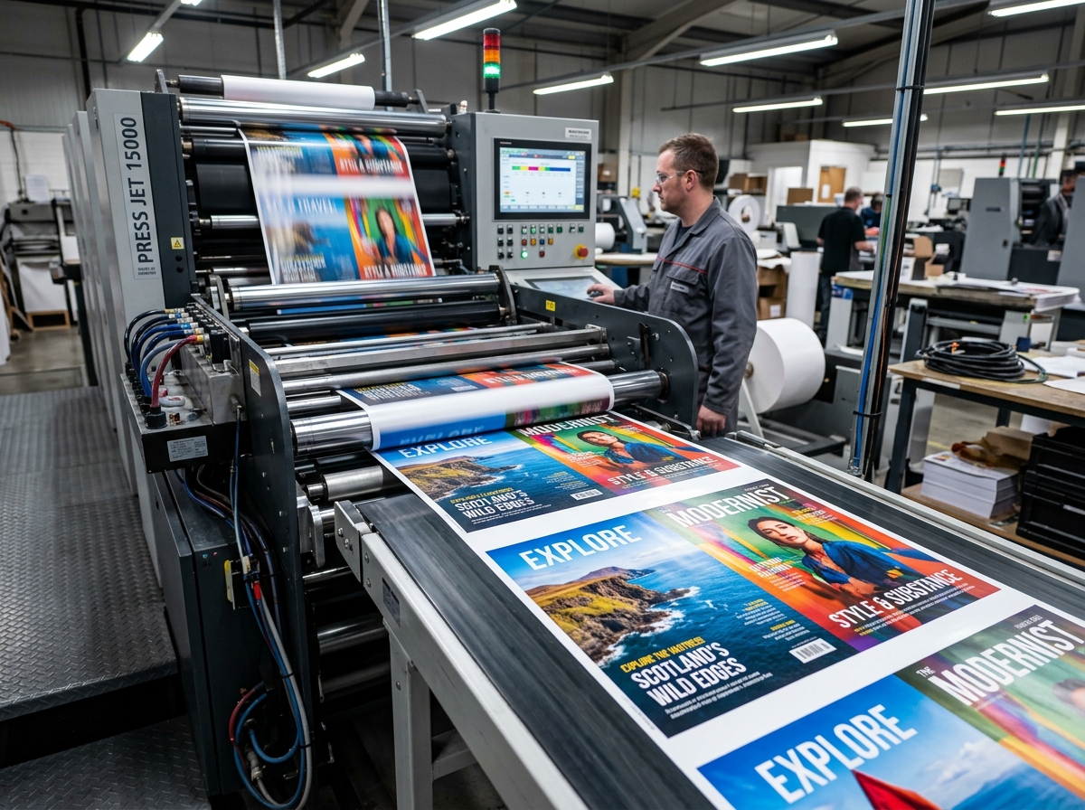
Premium editorial design is hospitality. Your reader should feel taken care of from the first page to the last.